“And above everything was this shimmering diamond, which was Cocteau Twins”: PAUL WEST AND THE ARTWORK OF ‘HEAVEN OR LAS VEGAS’.
Paul West is an English graphic designer and artist who’s past clients include Depeche Mode, Elbow and dream-pop pioneers Cocteau Twins. Paul and I discussed the landmark album Heaven or Las Vegas and his process for creating it’s iconic artwork.
As a student at the London College of Printing (now the L.C.C.) West was fixated on designing fictitious record covers, completing his thesis on how well a record cover illustrates the music it packages. This thesis led to a case study on designers such as Vaughan Oliver (Pixies' Doolittle) and Peter Saville (Joy Division's Unknown Pleasures), eventually leading to a series of freelance work with both artists.
By his early twenties West had been working prolifically with Vaughan Oliver on non-record sleeve projects external to the famed 4AD label. West enjoyed writing the thesis, Oliver enjoyed reading it, and after asking when the next Cocteau Twins album would be released, Oliver replied "well, when you design it." And thus Blue Bell Knoll's artwork came to be. West recalls feeling the pressure of working alongside one of his influences: "how on earth do you walk in the footsteps of somebody like Vaughan Oliver, with a band like the Cocteau's, on a label like 4AD?"
Working alongside fellow designer Jeremy Tilston to build on Oliver's textural, dreamlike work, West aimed to bring a more monochrome set of ideas to Blue Bell Knoll that aligned with the punk-fanzine image that Robin Guthrie (Cocteau Twins) was looking for. "It was very frantic but really exciting, because the late-80s was an amazing time to be in music. There's a lovely naivety when you look back - it's all very post-punk, pre-and-post-rave and there're all these elements sprinkling around the design sensibility of the time." West used lime green on the Heaven or Las Vegas font, a reference to post-rave colour markers of the time, alongside mauvy purples and acid yellows, a palette which he admits made it's way into the album's colour library. On top of this was some frequent dabbling in Sans Serif typography, a contrast to Oliver's aptness for large and bold typographic structures (see the Pixies' Doolittle and the Breeders' Last Splash for comparison).
West's involvement in the Heaven or Las Vegas project stemmed from his work on Blue Bell Knoll. He was brought in by Vaughan Oliver to continue the band's campaign, and, after some other designs for the group, was approached directly by Robin Guthrie. Meanwhile, Cocteau Twins were busy dividing their time between touring and developing their September Sounds recording studio. "Robin (Guthrie) and Simon (Raymonde) were really excited with all the kit they had got. I went down there quite a bit, just to take notes, get a flavour of the studio (and) see what the vibe was, so I saw a fair bit of them - obviously I was a huge fan and I was freelancing at the time so at the drop of a hat I'd be down there. I probably went down more than I should've, just because it was so exciting."
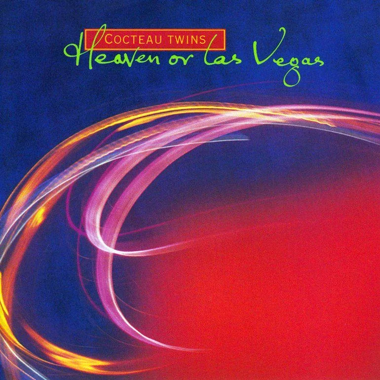
Robin Guthrie told West "I want you to capture the ethereal." "It's the kind of thing which is mind-blowingly exciting and intensely difficult because it's a completely abstract concept," says West. Looking at the wider context of technological capabilities of that era, West acknowledges the lack of tools like Photoshop, the artwork having to be shot on transparencies and later developed. They made colour Xeroxes that proved difficult to please Guthrie. "I really liked Robin's creative process because he knew what he liked and he definitely knew what he didn't like."
"Would you say he's a perfectionist?", I ask West. "As I'm getting older I'm finding that phrase quite a difficult thing to define: "what is a perfectionist?" because everybody's idea of perfection is completely different. I just think that Robin was a purely instinctive artist and if he liked it, he loved it and if he didn't like it, then that wasn't it. Unfortunately for us, in those days it took quite a long time to actually get to that stage. By an act of almost poetic intervention it was literally the last day of the deadline for artwork to actually create an image."
(Photographer and longtime friend) Andy Rumball converted his bathroom into a makeshift photography studio and the duo stayed up all night experimenting with lights, blurs, gels and any other "nebulous imagery" they could conjure. "We didn't even work off Polaroids so we didn't know the way it was looking." Rumball happened to do a long exposure - "he was holding an object against the camera lens and I was in the background whipping Christmas tree lights backwards and forwards. I'd love to dress it up and say that it was a staged shot - it was completely random. It was one of a few. We didn't go to bed."
Towards the end of their all-nighter, West and Rumball went to their local Metro shop in Clerkenwell, London and had the transparencies developed quickly. "I got little sheets of acetate and painted "Cocteau Twins" and "Heaven or Las Vegas" on a panel, and literally went down to show the band, thinking "Oh my God, please like this, please like it," and Robin just looked at it and went "Yep, that's great, let's go." "Everything flowed from that moment because what we had done looked so good. Some lovely crops became (the cover for) Iceblink Luck, the inside sleeves of Heaven or Las Vegas were different crops of a bigger image and suddenly we had a really lovely library of purely extracted, blissed out colour. This beautiful blue background happened to be a colour gel which was up at that moment and this wonderful, orange plastic flower was just up against the camera lens, so close that it went completely out of focus. It's a plastic flower which was super colourised, completely blown out of focus with this beautiful cobalt blue background and the purity of the light."
I asked Paul about the impact that H.O.L.V. has had on his career - one might think that a Cocteau Twins accreditation would lead to far more work, alone. Mere months after the end of this project, he and designer Paula Benson founded design group Form, quickly working through commissions from independent and major labels, alike, with each success simply feeding into the next. Perhaps Cocteau Twins' current status as a household name was not always the case. He does reflect on the impact social media has had on the notoriety of Cocteau Twins, opening the band up to an entirely new, fresh-faced fanbase. "My sister lives in Sweden - about a year ago she (and her daughter) were sitting outside a café. The window was open and Heaven or Las Vegas was coming out. My niece said "you really need to hear this band, they're amazing," and my sister said "yeah, Cocteau Twins - you do know that your uncle designed this cover, don't you?"
"I can't believe it. 1990: that was pretty much a matter of months before I set up Form with Paula, my partner. If I'd known that this album was going follow me my entire life... I've worked with Pendulum, Depeche Mode, Scritti Politti, All Saints - and yet Heaven or Las Vegas is the album cover which has followed me my entire life, really. It's bizarre."
"It's a magnificent album, a fantastic moment in musical history and I never get bored of hearing it. As a student, 4AD were the greatest label. I loved all of their bands through the 80s and 90s. Any band that came from 4AD, you knew that you'd like. And above everything was this shimmering diamond, which was Cocteau Twins. It's phenomenal."

Photos courtesy of paulwestart.co.uk